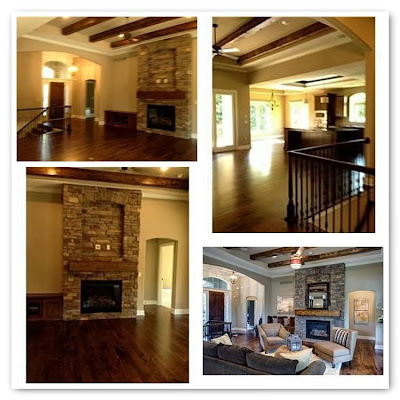
Today in Part 2 I'm going to explain what assets and issues are in the front room of this 2013 Home:
So this is a larger sized, brand new house, with the latest and most popular materials and finishes. We've got the grey walls, the brown floors, the brown timber ceiling beams, a dry stack rock fireplace that goes all the way to the ceiling, some arch doorways, and a built in seat/cupboards on one side of the fireplace.

The issues with the room are the many openings in and out of the room. It is centrally located--which is very desirable with the American lifestyle right now, but that means less wall space for furniture and art and ... personality! You'll notice that the people who staged the room used a rug to anchor a few pieces of large furniture. This works well with such a large scale room :)
Tomorrow I'll make an easy inspiration board for furniture and art and accessories for the room. I'll be making it unique for pretend clients.


0 comments:
Post a Comment